Building a Component for Logos while Documenting
ServiceNow is a cloud-based enterprise platform that automates digital workflows and connects different departments across an organization. I elevated productivity and insights for the therapist and patients portal for UX and UI, user testing, data collection, design iteration, and working within limitations of the HelloHero dashboard and platform experiences.

Overview
Seeing that the logos on the site were looking very large next to smaller logos. We identified a need to create a logo block component that would help the scalability on the pages that show logos on the site.
Context
Wrong

Correct
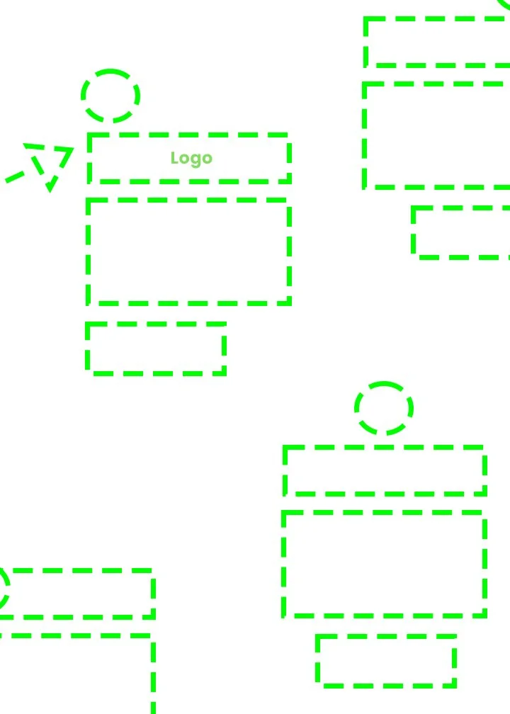
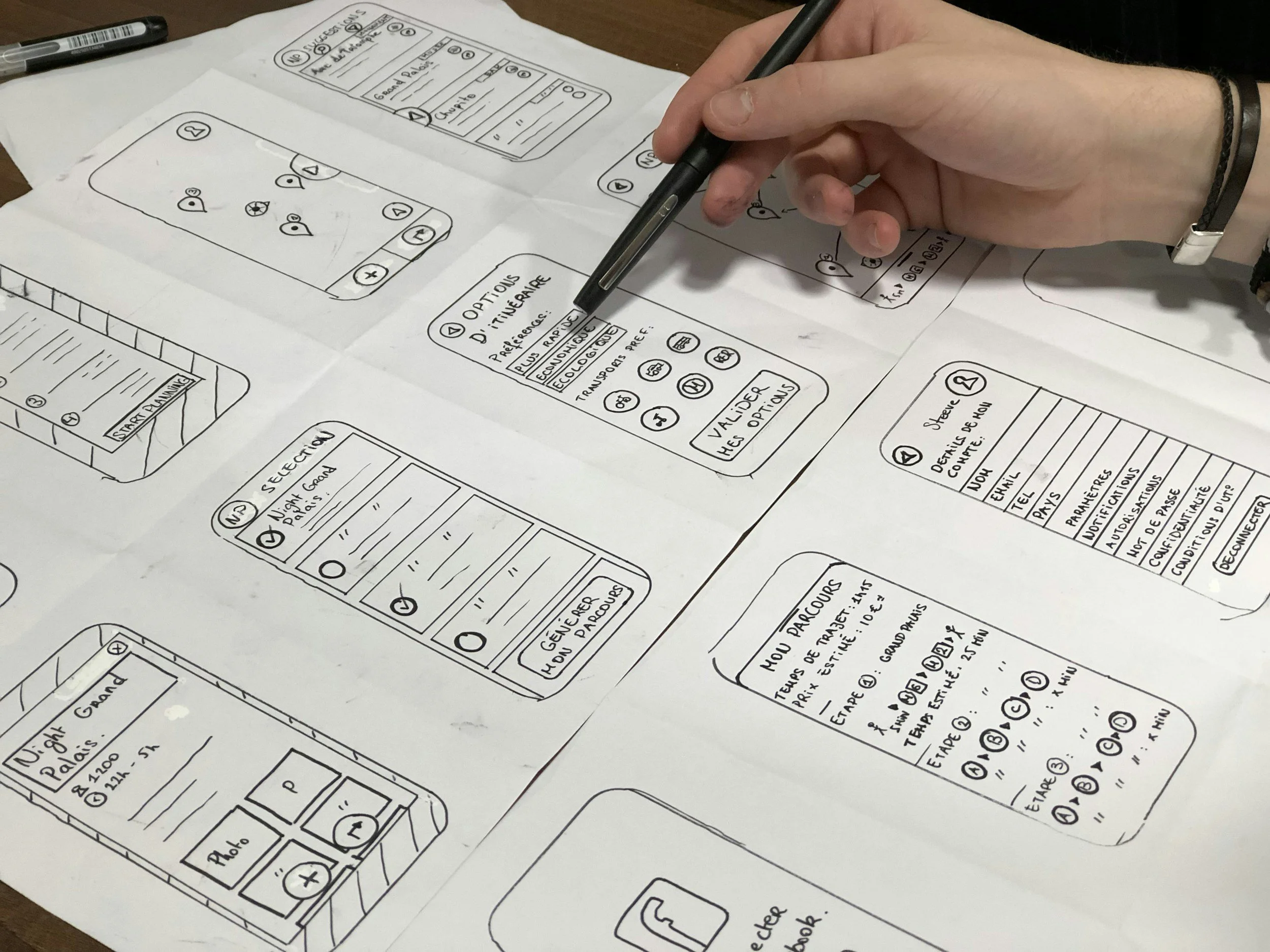
I iterated and drew some wireframe scenarios. Looking into our component library, I found redundant components, such as multiple links for “Demo” and “Explore Demos.” I recommended consolidating similar options—for example, combining “Contact Us” and “Get Started”—to reduce confusion and cognitive load.
The red areas above show logos that are not in the component. They all are different sizes and look disorganized. I discovered problems users were having and helped solve them. The user behavior and website analytics to identify usability issues and areas of information overload. The homepage received around 5,000 daily visits, while some buttons received fewer than 500 clicks, highlighting opportunities to simplify navigation.

Three Key features
How it works
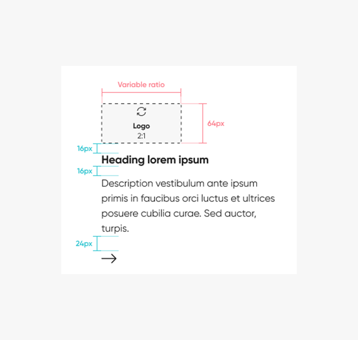
When the viewer scrolls to one of the sections on the ServiceNow site, they will see this component in action. Think of the "Logo Block" as a basic building block in our design system, like a Lego piece that can show a logo along with some text. It can be used by itself or put together with other pieces to create more complex designs. This block includes an image, a title, some text, and a button to take action. We have different versions of this block, each adjusting to the size of the logo. The block is set to be a certain height, and it changes its width to match. It has a light color scheme, and you can choose to align it to the left or center. The cool part is that as you work on different devices or screen sizes, the text and logo adjust to look just right. User feedback.
Test the Prototype
When we create each part, we pay close attention to its name, where it changes, and how big it is. This helps it do different things when you use it, like when you click on it or if there's an error. We also add labels and iconography to make sure everything fits together and makes sense. It's important that all the buttons and little pictures look the same across the whole website so it looks neat and organized. We decide on standard sizes, shapes, and styles to make everything look like it belongs together.

Advantages of the Logo Block
In the initial stages, we aimed to allow logos to fit within a 2:1 ratio for all types in the Logo Block component. The primary objective was to simplify the process for designers to seamlessly integrate logos from the library into various project elements. However, a challenge emerged as logos were displaying in different sizes, prompting the need for resolution.
Unified design for logo block
Here, creativity meets opportunity. Whatever you're building, we're here to help you take the first step with confidence. Driven by curiosity and built on purpose, this is where bold thinking meets thoughtful execution. Let’s create something meaningful together.
-
The approach streamlines processes, optimizing time and resource utilization for incorporating logos seamlessly.
-
Designed with a consistent 2:1 ratio for each logo, the Logo Block allows easy expansion or adaptation to accommodate growing demands or changes.
-
This approach offers ample room for adjustments and modifications, ensuring adaptability to evolving requirements in logo usage and presentation.
Summary
I added logo block to our internal documentation site for other designers and developers to view.
You can use the logo block component to display a logo and description. It can only be nested inside more complex components, such as carousel. The logo block includes a logo with optional heading description and call to action (CTA). The logo block canvas height is set at 240px, with the width scaled proportionally. There are five template frames available based on the width and height of the logo. The text wraps responsively to the width of its parent container. There are two options for alignment shown above, left and center aligned. For each breakpoint, the heading and description font sizes, along with the logo, adapt dynamically at every breakpoint to suit various layout widths and screen dimensions.